Map layers
You can add one or more layers to each map, displaying data from your model database. In general, the layers fall into two categories:
- Points layers – These layers display locations on the map, such as sites and customers. The sites can be from input tables or output tables. For each point layer, you control the shape, color and size of the icons that represent the locations.
- Connections layers – These layers display the flows from one location to another. They are based on flows from output tables. For each connection layer, you control the line type and color of the lines that represent the flows.
- Shapes layers – These layers display additional information, such as detailed geographic boundaries and regional data.
Each layer is displayed with a default graphic representation. You can configure this information so that location markers and flow lines are differentiated by values in the associated records. You can configure the location markers and flow lines as described in Map markers.
If you have locations defined with a Latitude outside this range (for example, -86.5), they are not displayed on the map. If you have connections, such as Customer Flows that use a location with a Latitude outside this range, those connections are not displayed on the map.
The Longitude limits for displaying locations is: >= -180 and <= 180
If you have locations defined with a Longitude outside this range (for example, -186.5), they are not displayed on the map. If you have connections, such as Customer Flows that use a location with a Longitude outside this range, those connections are not displayed on the map.
To learn more about maps, refer to:
- On the map, ensure the map controls are displayed. If this is a new map, the Add Map Layer form is shown by default. In this case, you can proceed directly to step 4.
- Click Show Layers.
- In the Layers section of the map controls, click Add. You see the Add Map Layer form.
-
To create a new layer, click New Layer, then select the category of layer you want to create. Follow the steps in Create new map layers.
- For existing layers, navigate to the category of layer you want to add:
- Points – These layers include locations, such as Sites, Customers, and Transportation Stops.
- Connections – These layers are the flows between locations, such as Customer Flows and Transportation Routes.
- Shapes – These layers display additional information, such as geopolitical boundaries. You can select one of: Shaded Area Map, Shape File or Service Area Layer.
- Optionally, filter the list of Available Layers.
- Select the check box for each layer you want to display. You can select one or more layers from the Points and Connections categories to add at one time.
- Click Add.
- Once layers have been added, use the check box next to the layer name to control whether or not the layer is displayed.
- Drag and drop layer names to control the order in which the layers are displayed. The layer at the top of the list is rendered on top of the display, with remaining layers displayed in descending order. That is, the information for the first layer in the list will be displayed on top of other layer information. You can adjust the display order to control the information that is displayed on top.
You can create new point, connection and shape layers. Point and connection layers can be based on any input table, output table, user defined table or view. The requirements are:
- Point layer - Layer Name, Data Source and Location Property (such as a site or customer that can be displayed on the map)
- Connection layer - Layer Name, Data Source, Source Property and Destination Property, where the two properties are locations such as a site or customer.
- On the map, click Show Layers.
- In the Layers section of the map controls, click Add. You see the Add Map Layer form.
- Click New Layer, then select the category of layer you want to create (Point Layer, Connection Layer or Shape Layer).
- For point layers, enter/select:
- Layer Name
- Data Source - This can be one of the following: input table, output table, user defined table, view. The data source must include at least one column that can be used as the Location Property. This is a site or customer.
- Location Property - Select the column that is used to locate the record on the map. It will be a site or customer.
-
For connection layers, enter/select:
- Layer Name
- Data Source - This can be one of the following: input table, output table, user defined table, view. The data source must include at least one column that can be used as the Location Property. This is a site or customer.
- Source Property - Select the column that is used to locate the start of the flow on the map. It will be a site or customer.
- Destination Property - Select the column that is used to locate the end of the flow on the map. It will be a site or customer.
- For shape layers, refer to Shape layers to learn how to create a new layer.
- Click Add. The layer is created and is added to the appropriate category of available layers. You can now select the layer and click Add.
For example, you can create a map layer based on a view using the Cost To Serve Details output table. In this case, we'll call the view "Cost To Serve View" and include the following columns in the view configuration:
- Finished Good
- Start Location Name
- End Location Name
- Total Cost
On the map, follow the steps above to create a new connections layer with the following values:
- Data Source - Cost To Serve View
- Source Property - Start Location Name
- Destination Property - End Location Name
Once you have added the new layer to the map, you can optionally add a scale differentiator based on Total Cost.
You can delete layers you have created as described in Create new map layers. You cannot delete the pre-defined points and connections layers. Deleting a layer removes is from any maps on which it was included.
- Click Show Layers.
- In the Layers section of the map controls, click Add. You see the Add Map Layer form.
- Click the delete icon for the user defined map you want to delete. You are asked to confirm the deletion.
- Click OK. The layer definition is removed. This affects all maps that included the layer.
When you open a map that included the deleted layer, you will see a message indicating the layer has been removed.
Map markers
For each layer, there are defaults for the color and style of the map marker. In many cases, the markers are differentiated based on a column value in the table records. For all layers, you can select one or more columns to be used to differentiate the markers.
When you display a map and hover over a map marker (for points or connections), a tooltip is displayed with information from the record represented by the marker. The contents of the tooltip varies depending on the source of the layer data.
- Click the edit icon
 for the map layer you want to configure. You see the Edit Markers form.
 The Differentiate field may be set to a default. If you want to differentiate by one or more fields, or scale the marker by the value in a selected field, see Differentiating map markers.
The Icon List displays a column for each field being used in the Differentiate list. A marker is shown next to each unique combination of Differentiate values.
- Select one or more rows in the Marker column for the marker you want to configure. Use Select All to select all markers.
- Click Edit. You see the Edit Marker form.
- Set the options for the marker characteristics:
Layer Type Characteristic Description Shape Select a shape from the predefined shapes for the marker. Points Size Select the size for the marker. Fill Color Select a fill color for the marker using one of the following methods:
- Standard Palette
 – Click the Standard Palette icon, then select a color.
 - Custom Color
 – Click the Custom Color icon, then use the vertical control to set the saturation.
 - HEX Value – Enter the hexadecimal value for the color you want to use.
Fill Opacity Enter a value from 0 to 100 to control how opaque the fill display is for the marker. Border Color Select a border color for the marker using one of the following methods:
- Standard Palette
 – Click the Standard Palette icon, then select a color.
 - Custom Color
 – Click the Custom Color icon, then use the vertical control to set the saturation.
 - HEX Value – Enter the hexadecimal value for the color you want to use.
Border Opacity Enter a value from 0 to 100 to control how opaque the border display is for the marker. Border Width Enter a value from 0 to 100 to control the thickness of the marker border. Connections Stroke Select the line style to use for the selected connection marker. Color Select a color for the flow marker using one of the following methods:
- Standard Palette
 – Click the Standard Palette icon, then select a color.
 - Custom Color
 – Click the Custom Color icon, then optionally use the vertical control to set the saturation.
 - HEX Value – Enter the hexadecimal value for the color you want to use.
Straight Lines
Arcs
Detailed Road Paths
Select whether the connections should be displayed as:
- Straight Lines – The connection is displayed as a straight line between origin and destination points.
- Arcs – The default display is arcs between origin and destination points.
- Detailed Road Paths – If road route data has been saved with Calculate Detailed Paths, the connection is displayed with legs as defined by the road path calculation. See Calculating Detailed Paths for additional information.
Shapes - Shaded Area Map Number of Breaks Select the number of individual breaks to be included in the map display. Each break is displayed with a unique color. The values for the breaks are determined using the values for the selected field as:
(Largest Value - Smallest Value) / Number of Breaks
Start Color Select the color to be used for the first break on the shaded area map. Colors are adjusted between the Start Color and End Color for the remaining breaks. End Color Select the color to be used for the last break on the shaded area map. Shapes - Shape File Fill Color Select a fill color for the shape using one of the following methods:
- Standard Palette
 – Click the Standard Palette icon, then select a color.
 - Custom Color
 – Click the Custom Color icon, then use the vertical control to set the saturation.
 - HEX Value – Enter the hexadecimal value for the color you want to use.
Fill Opacity Enter a value from 0 to 100 to control how opaque the fill display is for the shape. Border Color Select a border color for the shape using one of the following methods:
- Standard Palette
 – Click the Standard Palette icon, then select a color.
 - Custom Color
 – Click the Custom Color icon, then use the vertical control to set the saturation.
 - HEX Value – Enter the hexadecimal value for the color you want to use.
Border Opacity Enter a value from 0 to 100 to control how opaque the border display is for the shape. Border Width Enter a value from 0 to 100 to control the thickness of the shape border. - Standard Palette
- Click Apply.
Differentiating map markers
You can differentiate map markers in two distinct ways:
- Categorize – Unique marker colors (and optionally other characteristics) are assigned based on the value of the field you select. You can select one or more Categorize fields to uniquely identify map markers.
- Scale – The size/width of the map marker is scaled based on the values of the field you select. You can scale based on one field per layer.
- Click the edit icon
 for the map layer you want to configure. You see the Icon Editing form. The Differentiate list identifies which column(s) are being used to differentiate marker display. The Icon List displays the set of column values for each column used to differentiate. A marker is shown next to each unique combination of column values.
 - If you want to configure additional columns to differentiate your markers, click Add, then select Categorize
- Next, select the Field Name for the new marker from the drop-down list and click
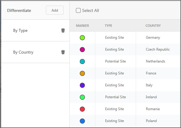
For example, for the Sites table, you have the first Differentiate field set to “By Type”. In this case, “Existing Site” and “Potential Site” each have a unique marker:

- Next, click Add, then select Categorize
- You can remove any Differentiate field by clicking Delete
 next to the field.
 - Select one or more markers, then click Edit to configure the Map layers.
- Click the edit icon
 for the map layer you want to configure. You see the Icon Editing form. The Differentiate list identifies which column(s) are being used to differentiate marker display. The Icon List displays the set of column values for each column used to differentiate. A Marker is shown next to each unique combination of column values.
 - If you want to configure additional columns to differentiate your markers, click Add, then select Scale
- Next, select the Field Name for the new marker from the drop-down list.
-
-
- Click OK.
For example, for the Customer Summary Sites table, you want to scale the marker based on the Total Demand for each customer. On the Edit Scale window, select “Total Demand” from the drop-down list of fields. In this case, the customers with the lowest demand will have map markers of the smallest size.
- You can remove any Differentiate field by clicking Delete
 next to the field.
 - Select one or more markers, then click Edit to configure the Map layers.
If the table used for the map layer is currently filtered and you edit the Maximum Values for the scale bands, you can observe duplicate bands. This occurs when the actual maximum for the filtered data is less than two or more of the Maximum Values. To resolve this, reduce the number of scale bands or adjust the Maximum Values to be smaller than the actual maximum. Only the final Maximum Value should be greater than the filtered maximum.
- Click the edit icon for the map layer you want to configure. You see the Icon Editing form. The Differentiate list identifies which column(s) are being used to differentiate marker display. The Icon List displays the set of column values for each column used to differentiate. A marker is shown next to each unique combination of column values.
- Click the edit icon for the differentiate item you want to edit. The current differentiate definition is displayed. You can change the field by which to differentiate, and if you are using Scale, you can adjust the Number of Scaling Bands and their Maximum Values.
- Click OK.
Map layer table grids
For any of the points or connections, you can display a table grid with the records from the table associated with the points or connections layer. You can filter and sort the data in the table grid.
When you select a record on a table grid, the marker changes color so that you can identify which marker represents the record.
Points layers
These layers display locations on the map, such as Sites and Customers. The sites can be from input tables or output tables.
Point layers include:
- Customers
- Sites
- Cost To Serve Location Summary - This layer displays total throughput quantity, production cost and inventory holding cost by location based on Cost To Serve Product Details.
- Customer Summary Sites
- Site Summary Sites
- Customer Demand Profile Sites
- Greenfield Customers – This layer displays information from the Greenfield Flows table.
- Greenfield Summary Sites (Greenfield Lat/Long) – This layer displays information from the Greenfield Site Summary table where Output Type = Greenfield Lat/Long.
- Greenfield Summary Sites (Closest City) – This layer displays information from the Greenfield Site Summary table where Output Type = Closest City.
- Inventory Summary Sites
- Simulation Summary Sites
- Simulation Summary Customers
- Site Demand Profile Sites
- Transportation Stops
Connections layers
These layers display the flows from one site to another. They are based on flows from output tables.
If you want to display detailed road routes for your connections layers, you will calculate detailed paths in the Transit Matrix table or in the Segments table (for Transportation Optimization only). For additional information, refer to Calculating detailed paths.
Connections layers include:
- Customer Flows
- InterSite Flows
- Shipments
- Delivered Shipments
- Greenfield Flows
- Input Shipments
- Multi-Stop Estimated Flows - based on the Multi-Stop Estimation Summary output table.
- Multi-Stop Estimation Failure Flows - based on the Multi-Stop Estimation Failure Summary output table.
- Periodic Delivered Shipments
- Return Flows
- Segments
- Shipment Output
- Simulation Flows
- Transportation Route Details
- Transportation Routes
Last modified: Wednesday May 15, 2024