Visualize your data
Within a workbench, you can examine how your model affects time series data in several different ways:
- Display your model data in a graph or table
- Review time series metrics for selected demand time series
- Review demand model metrics for the current model
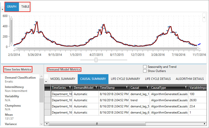
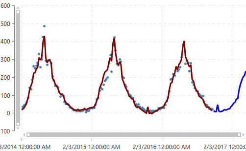
Display model data in a graph or table
When demand and forecast data is displayed on the graph, the historical fit is represented in the first part of a continuous line overlaying the data points, and the forecasted fit represented by the second part of the line, which is shown in a contrasting color.
Review time series metrics for selected demand time series
- Demand Classification
- Intermittency
- Variability
- Clumpiness
- Mean
- Variance
- Median
- Skewness
- Frequency
- Forecastability Index
Review demand model metrics for the current model
- Demand model metrics
Displays information on algorithm used, along with error metrics that help determine the accuracy of the forecast.
- Causal Summary
Lists causal variables and their ranking in the model, along with detected trends, to help determine which factors are driving demand. Based on this information, you can select one or more relevant causal time series for inclusion in the demand model graph to examine their correlation to the data.
- Life Cycle Summary
If Life Cycle was chosen as the Demand Model Type, this table highlights the various performance measures that are generated from life cycle modeling.
- Life Cycle Details
If Life Cycle was chosen as the Demand Model Type, this table consists of seven rows, one for the entire life of the product, plus one for each of the different life cycle stages.
- Life Cycle Parameters
If Life Cycle was chosen as the Demand Model Type, this table displays life cycle model parameter estimates.
- Algorithm Details
Provides information on how the algorithm was used in the model.
Last modified: Thursday December 19, 2024