Defining graphs
For each graph, you choose the source data, the type of graph and the fields to be displayed. You can also control the display of the graph legend.
- Select Analyze > Graphs.
- Click New Graph and edit the name as required. You see the Graph Configuration form.
- In the Source Name area, select a member of one of the following sources:
- Views
- Output Tables
- Input Tables
You can also start typing to locate specific table names.
- Select the type of graph you want to view:
Bar

Stacked Bar

Column

Stacked Column

Pie

Line

- In the Available Dimensions area, select the field(s) by which the data will be measured and move the field(s) to the Selected Dimensions area. For example, on a column graph, these are the values displayed along the X-axis. The order of the Selected Dimensions fields determines the order in which these values are displayed on the graph.
- In the Available Measures area, select the field(s) for which the values will be displayed and move the field(s) to the Selected Measures area. For example, on a column graph, these are the values displayed on the Y-axis. The order of the Selected Measures fields determines the order in which the measures are displayed on the graph.
- In the Differentiate By drop-down list, select one or more of:
- Measures – When Measures is selected, the colors of data points on the graph are unique for each measure.
- the Dimensions fields – When one or more of the Dimensions fields is selected, the colors of data points are unique per value of the selected dimension.
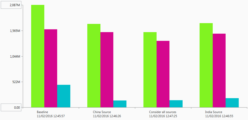
For example, assume you have created a graph using the Network Summary. The Selected Dimensions are Scenario and Model Run Time. The Selected Measures are Total Cost, Total Production Cost and Total Transportation Cost. When Differentiate By is set to Measures, the graph looks like this:
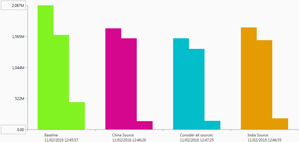
When Differentiate By is set to a Dimension, such as Scenario, the graph looks like this:
 If you are using stacked bar or column graphs, you will typically want to differentiate by Measures. This results in each measure being a different color in the stacked bar or column.
 - Click Apply to display the graph. You can use Revert to undo any configuration changes you have made.
- Use the scrollbar or page numbers to review the grid data.
- Optionally, turn on the Show Non-Zero Measures switch to prevent display of items that do not have a value for the Select Measure setting.
- Optionally, turn on the Hide Labels switch to prevent display of the labels on the X-axis and Y-axis.
- Optionally, adjust the Items per Page. By default, 20 items are displayed on a page.
- Optionally, turn on the Legend switch to display a legend for the graph.
- Click Configuration to return to the Graph Configuration form.
- Turn on the Legend on the graph. You see individual nodes for each of the unique values specified by the Differentiate By setting. For example, if you have set Differentiate By to “Scenario”, each scenario is shown with its own node and color setting. If you have set Differentiate By to “Measures”, each field in the Selected Measures is shown with its own node and color setting.
- Use the check box for individual nodes to turn their display on or off, or use Select All to control the display of all nodes.
- Turn on the Legend on the graph.
- Click the edit icon
 for the graph item you want to configure.
 - Set the options for the item characteristics:
Characteristic Description Fill Color Select a fill color for the marker using one of the following methods:
- Standard Palette
 – Click the Standard Palette icon, then select a color.
 - Custom Color
 – Click the Custom Color icon, then use the vertical control to set the saturation.
 - HEX Value – Enter the hexadecimal value for the color you want to use.
Opacity Enter a value from 0 to 100 to control how opaque the fill display is for the marker. - Standard Palette
- Click Apply.
- By default, measures with 0 as a value are displayed as data points on the graph. Turn on the Hide Zero Measures switch to hide these measures. Data points with a value of 0 are no longer displayed.
- By default, labels are displayed along the X-axis and Y-axis of the graph. Turn on the Hide Labels switch. Labels are no longer displayed along the axes.
When you show graph labels, only one row of labels is displayed. Depending on the size of the graph form and the length of the labels, there may be cases where the labels for some data points are not displayed.
Last modified: Wednesday May 15, 2024