Time series data
Demand Guru provides two methods for visualizing your time series data:
- Graphical format, in a plot based on demand model type
- Tabular format, in a time series table
In a time series graph, the original demand data is represented by dots in the plot. Additionally, you can observe fitted values, forecast values/predictions and 95% lower & upper prediction intervals.
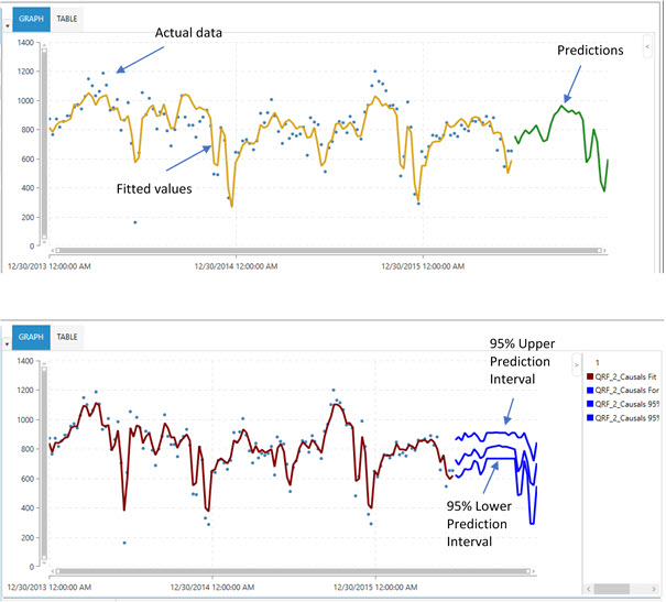
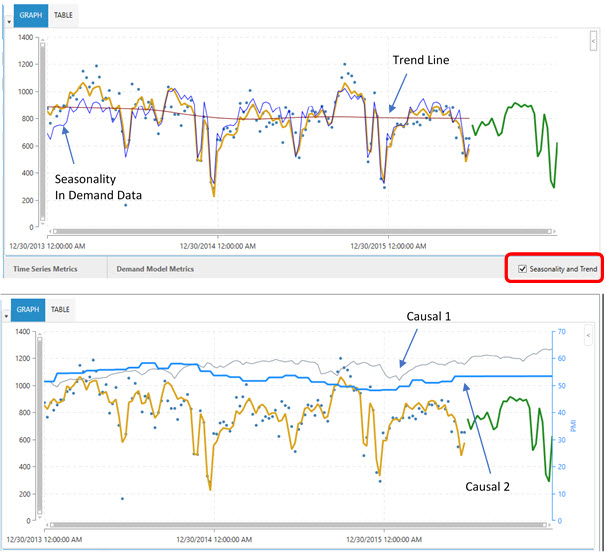
Only certain algorithms can produce prediction intervals around the predictions. To view seasonality effects and trend patterns, select Seasonality and Trend at the bottom right corner of the plot. Similarly, you can overlay active causal variables on the same plot to observe relationships between various causal variables and demand data.
Similar to Time Series Forecasting plots, Life Cycle plots show the original demand data as points. However, fitted values are represented by a solid line, which appears in blue after the fitted data to mark forecast values/predictions. This plot also shows 95% lower and upper prediction intervals on the forecasted demand values.
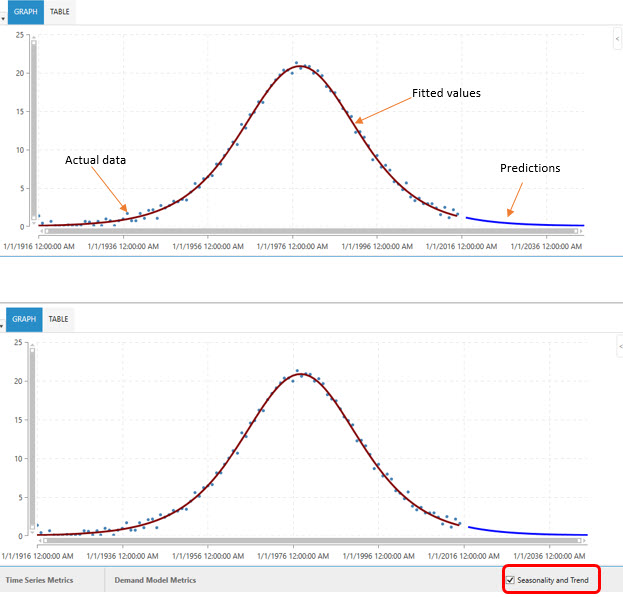
For this demand model type, selection of the Seasonality and Trend check box has no effect on the plot. In addition, no causality can be in effect in life cycle modeling.
Cannibalization effect on life cycle graph
When you use the Cannibalization option, the graph includes both the non-cannibalized curve and a cannibalized curve.
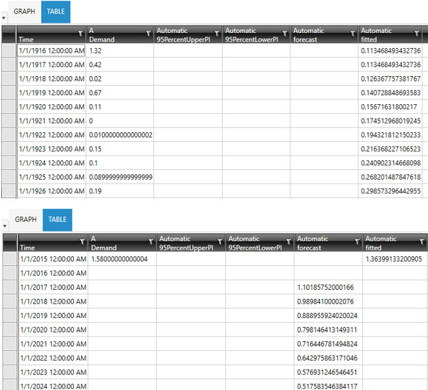
The time series table tabulates the fitted and forecast values corresponding to a time series. Prediction intervals, if determined, are also tabulated.
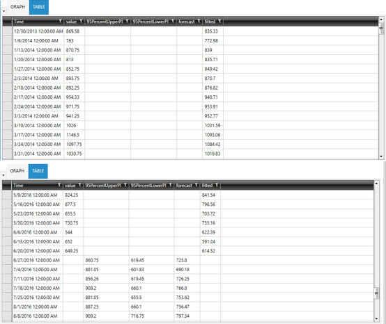
Time index corresponding to a specific demand data point.
True demand corresponding to a specific time point.
Lower band of the prediction interval around the mean of the demand at a 95% confidence level.
Upper band of the prediction interval around the mean of the demand at a 95% confidence level.
Fitted demand values predicted over the historical data by the selected algorithm.
Forecast demand values produced by the selected algorithm over the specified forecast horizon, using the trained model.
Tabulates the fitted and forecast values corresponding to a time series. Prediction intervals, if determined, are also tabulated.
Time index corresponding to a specific demand data point.
True demand corresponding to a specific time point.
95PercentLowerPI and 95PercentUpperPI
These two columns display 95% lower and upper prediction intervals for forecast values.
Fitted demand values predicted over the historical data by the selected algorithm.
Forecast demand values produced by the selected algorithm over the specified forecast horizon, using the trained model.
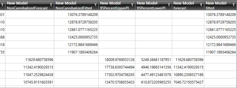
Cannibalization effect on life cycle table
When you use the Cannibalization option, the table grid includes additional columns to separate the non-cannibalized and cannibalized results for the fitted and forecast fields.
Last modified: Thursday December 19, 2024